Case Study: Olive!

Objective
Olive is an intuitive, responsive health & wellness app that integrates handling medical tasks with pursuing personal health goals so as to encourage users to prioritize their wellbeing.
Purpose
The project was meant to showcase my work, process, & skills as a UX/UI designer. This was an individual project with the supervision and mentorship of a Senior UX designer.
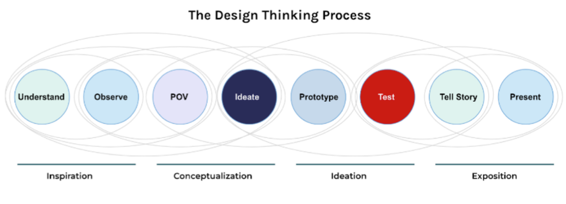
Process
Design Thinking & User-centered design.
Tools
- Pen & Paper
- Figma
- UsabilityHub
Role
- UX Designer
- UI Designer
- UX Researcher
1) Understand
To fully comrehend the problem and get a better understanding of the marketplace, I ran a competitor analysis on key competitors- such as WebMD and MyChart. This would help me understand and identify product opportunities by observing what works vs what does not when it comes to handling health needs online. I performed S.W.O.T analysis and a UX analysis - which evaluated their usability, layout, navigation structure, compatibility, differentiation, and call to action. This helped me identify product opportunities for an app that integrates handling multiple health aspects in a quick & trustworthy way while encouraging users to pursue healthier habits.
Problem
Olive’s users need a safe, quick, & reliable way to manage personal medical tasks in a timely manner while being incentivized to follow healthier habits– such as engaging in physical activity, a healthy nutrition, better sleep, & being informed on overall mental wellbeing.
Proposed Solution
We believe that by facilitating a way for users to manage real, medical tasks– as well as personalized, wellness features & informative facts– we will encourage users to prioritize their well-being.
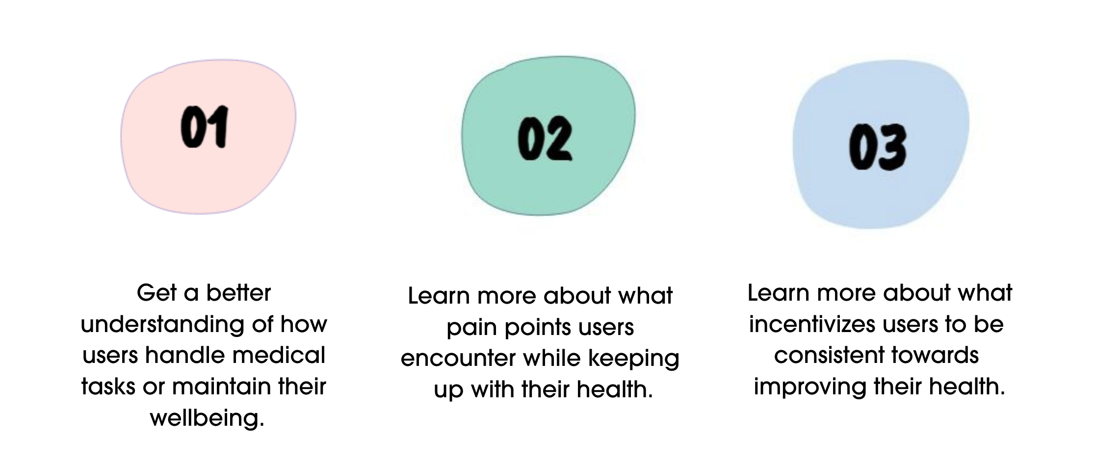
User Research
Before proceeding to create user flows and moockups, I wanted to get a better understanding & observation of our potential users. I conducted a few interviews with 3 goals in mind:
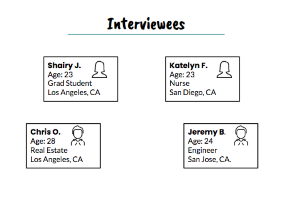
Prior to the interviews, I ran a short survey composed of 14 questions total, with 6 short free-response questions and the rest as MC. The goal was to obtain at least 10 responses. I obtained 14 in less than 3 days. I recruited two interviewees based on those responses. The other two interviewees were health-conscious colleagues. I recruited those who seemed genuinely interested in improving their health & had experienced tracking their health or booking appointments through websites and/or apps.
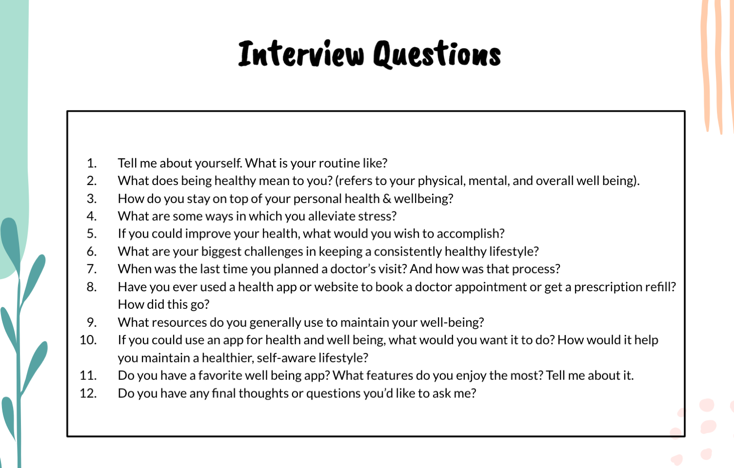
These were the interview questions
High-level Insights
- All participants are health-conscous individuals
- People get discouraged when appointments by phone are difficult or tedious to make.
- Participants are struggling with keeping a consistent sleep schedule, which leaves them feeling lethargic.
- People feel motivated by influencers, visual representations of progression, notification nudges, and/or motivational reminders.
- Sometimes other things prioritize people’s health routines.
- People need a plan or a routine to feel progression.
2)Observe
For further analysis, I sorted through the data for behaviors, attitudes, frustrations, and needs/goals. Then, I used affinity mapping to cluster my data into insights
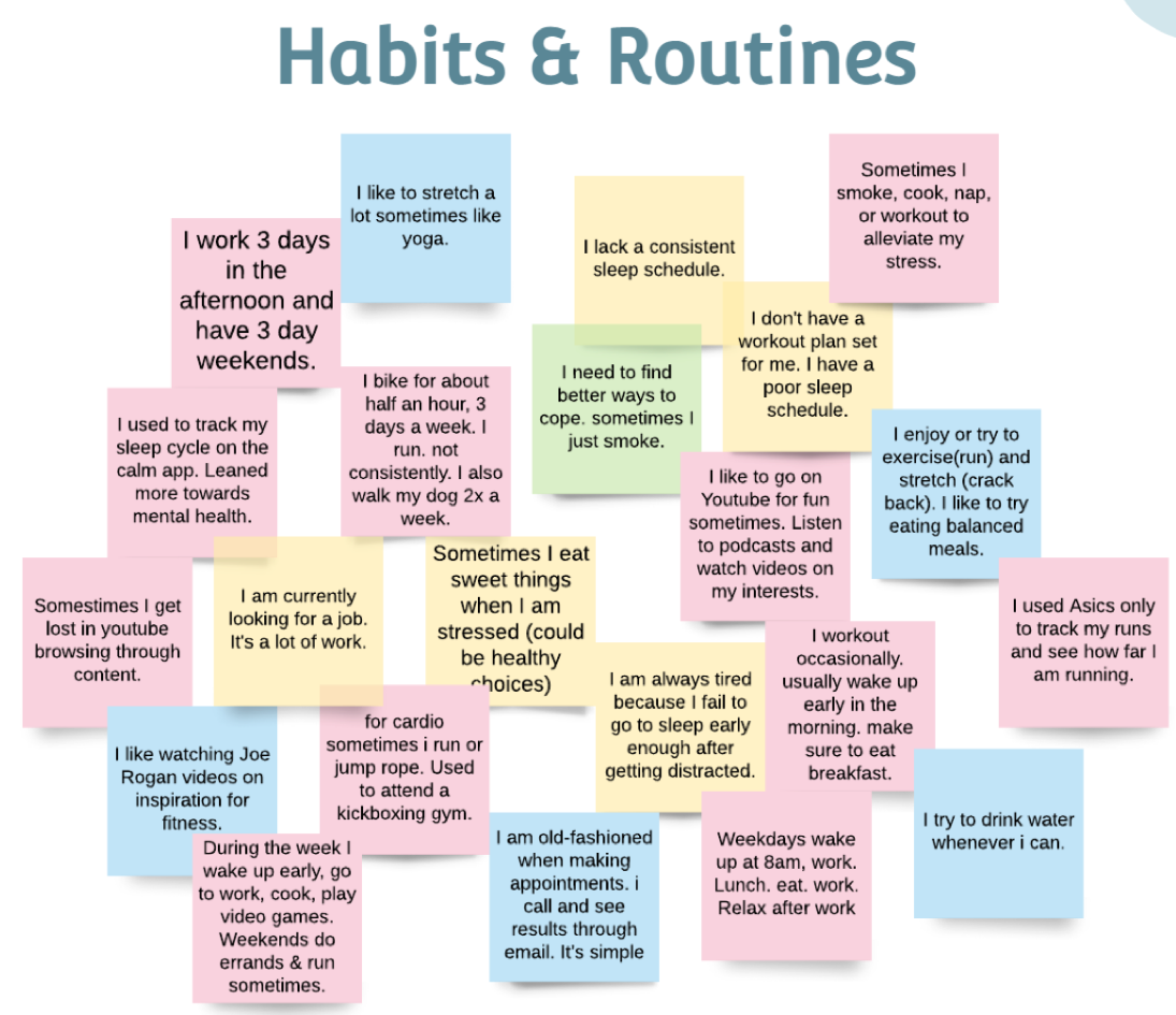
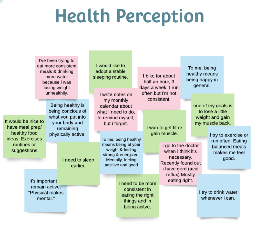
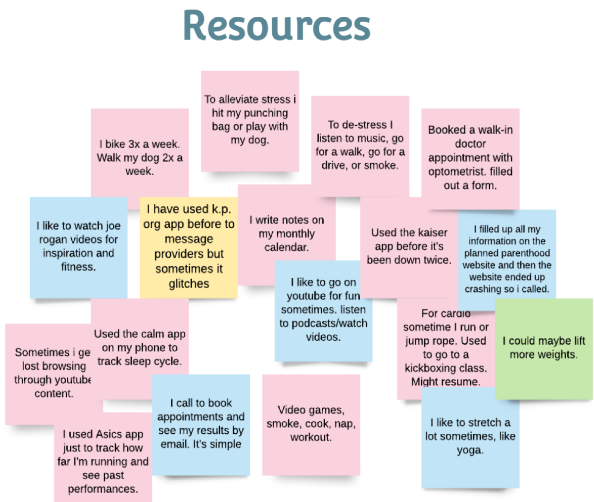
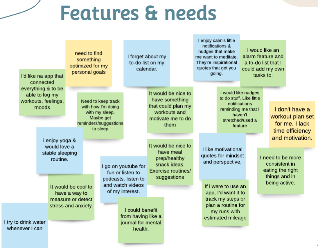
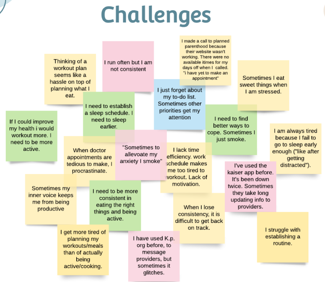
Affinity Map Insights
Many users desire to establish consistency in either sleep, overall routine, eating habits, or physical activity…
- People seem to be too busy to make their own workout schedules or think about, & search for, healthy food alternatives.
- Many lack motivation to workout.
- Participants predominantly contact providers the old-fashioned way (via phone) but some have had failed attempts at doing so online.Others have messaged providers successfully but encountered minor setbacks.
- People need to be presented with a variety of personalized workouts/meals/health feature options.
- Sometimes users begin to lose their good habits early on.
- Influencers or motivational content may inspire users to make healthier choices.
3) POV
User Personas
Analyzing my findings gave me better insights into the target audience. I was able to discover how they interact with products and task management. I was also able to dig deeper into what drives their internal and external motivations
To realistically portray our target users and establish empathy towards who we’re designing for, I created user two user personas. These were based off my findings and user needs.
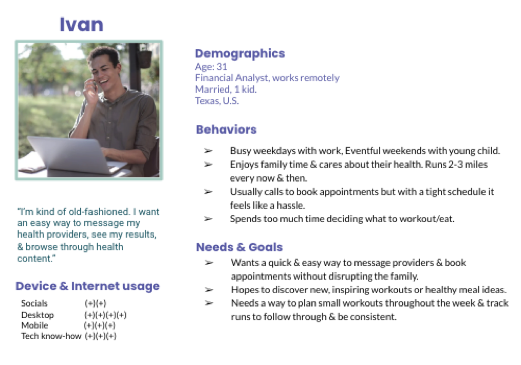
Persona #1
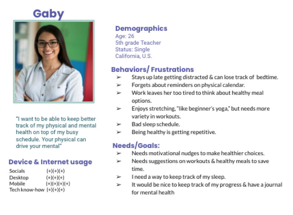
Persona #2
Once the target audience was put into a better perspective, I proceeded to map out user flows based on user behavior and task management. I created 3 possible flows for my top 3 features.
User Flows
Flow #1: Booking a Doctor Visit
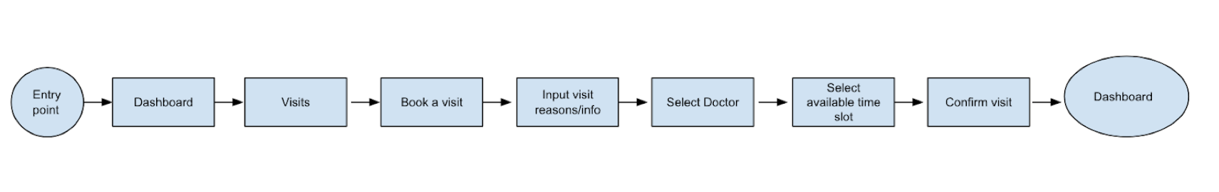
Entry Point
- 1)Home Screen
- 2)Dashboard/Medical Tab
- 3)Appointments/Visits
- 4)New Appointment
- 5)Reasons/Info
- 6)Select/confirm Doctor
- 7)Select date and time. Click confirm/save.
- 8)Confirmation shown. Back to Dashboard
Success Criteria
Doctor visit is scheduled.
Flow #2: Finding a Workout
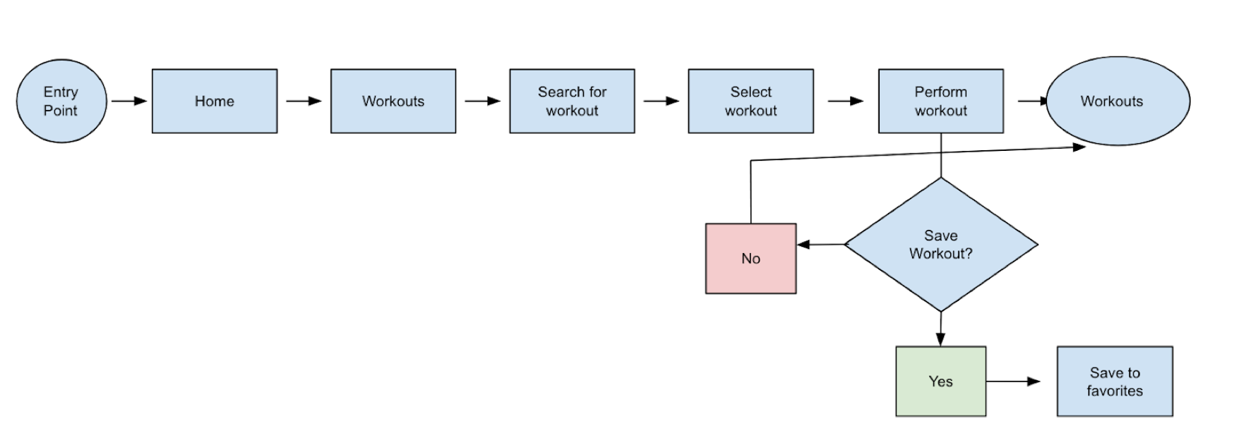
Entry Point
- 1)Home Screen
- 2)Workouts
- 3)Search for preferred workout
- 4)Select a workout
- 5)Perform workout. Favorite & save workout
- 6)Close workout/Land on 'Workouts'
Success Criteria
Wanted workout is found and performed.
Flow #3: Bedtime reminders/tracking
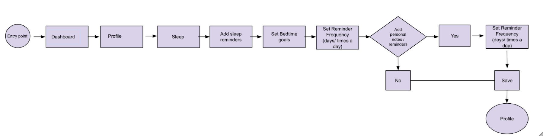
Entry Point
- 1)Dashboard
- 2)Profile
- 3)Settings/Sleep
- 4)Add Sleep reminders
- 5)Set reminder frequency
- 6)Set a bedtime goal
- 7)Profile
Success Criteria
Reminders & desired sleep routine is set
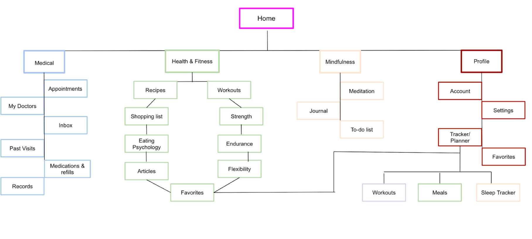
I mapped out user flows for the main functionalities of the app. This way, I would know what steps the user would take to get to their desired destination before laying out the information architecture. Based on my analysis and findings, I proposed the following sitemap...
Sitemaps
I created this sitemap with co-existing hierarchies so that users would have a general location in which to input their information as well as a page to find overall health-related information. I also isolated the medical and mindfulness tabs. The goal was for all sections to be easily accessible.
However, after conducting open card sorting I validated some of my beliefs but invalidated others. I had to make refinements to the sitemap so as to accommodate user’s mental models better.
Proposed Sitemap
4) Ideate
To establish how the app’s pages would be laid out before creating mockups, I conducted open card sorting with real potential users. I recruited 5 participants interested in completing a digital, open card sort. They created a total of 24 categories with a median of 4 categories each. I used OptimalSort and used all of the 20 cards allowed with the free plan to include the basics of the content that would be included on the sitemap. Based on the results, I iterated on the sitemap to produce the following:
Refined Sitemap
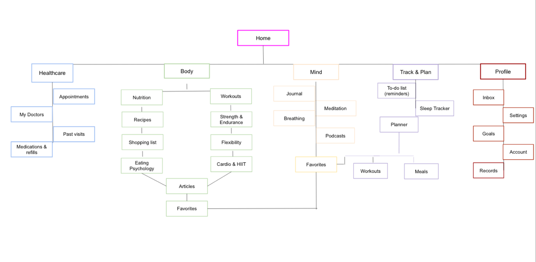
Analysis
After going through the data, I realized that my categories could use different naming conventions. Many participants separated physical aspects of health from mental aspects – which I was content about– but used slightly different terminology that was more upfront in its own way. Rather than ‘health and fitness’ and ‘mindfulness,’ these became ‘body’ and ‘mind,’ highlighting the area of focus in the user’s health as they navigate through.
Also, although there were a total of 24 categories created, many of the categories were similar in their groupings – such as ‘profile’, ‘general’, and ‘tools’. I noticed a lot of variety and discrepancies with some of the cards that required input or interaction from the user (like sleep tracker, workout planner, meal planner). Therefore, I decided to create another section labeled ‘Plan’ in the sitemap in which users will ideally plan out most of their activities such as reminders, workouts, and chosen recipes.
Most of the users categorized medical information and tools together. However, the majority included ‘records’ under the category of profile or general tools and account features. Therefore, I decided to include records and inbox under the user’s profile. This was also the case for “inbox” or notifications. Also, I realized that I could label “tracker” /“planner” as “Plan” and integrate as a co-existing hierarchy for easy access.
Low Fidelity Wireframes
Before going digital, I quickly generated ideas for my man features on paper.
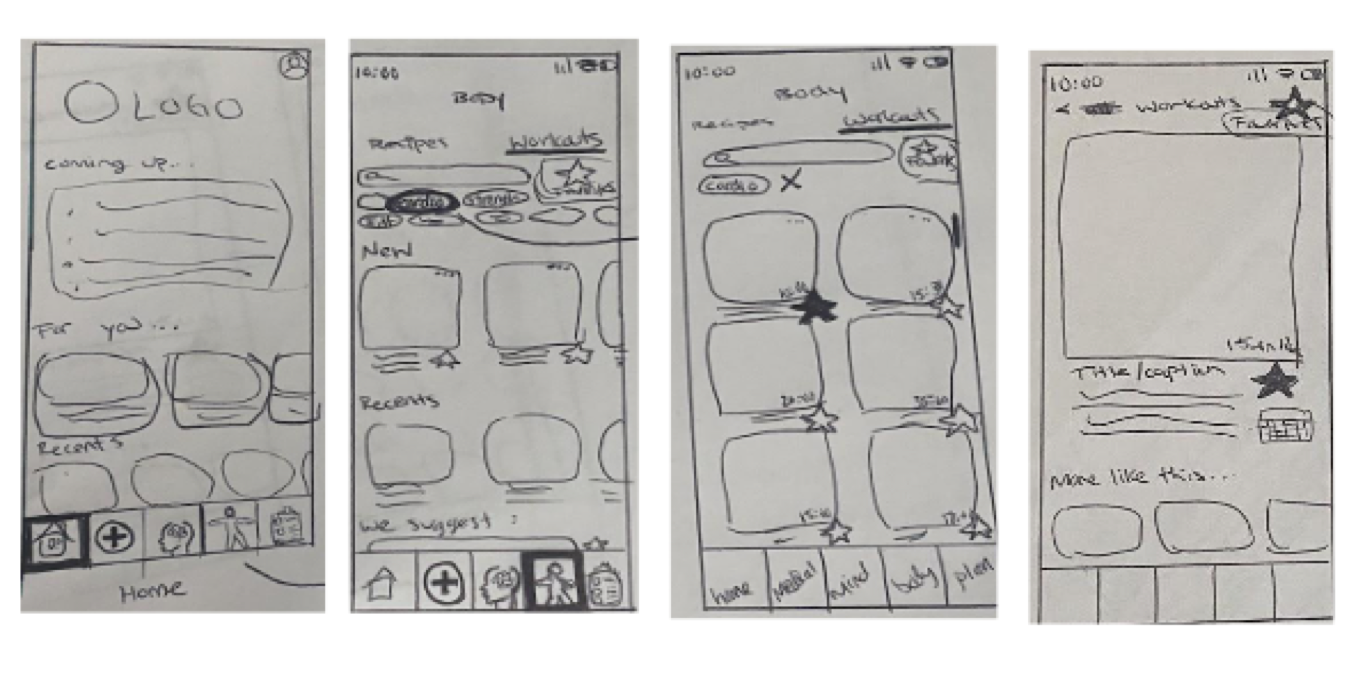
This feature was meant for users to quickly & easily navigate through the app’s workout page. It mostly shows high-level functionality and interaction. Avoiding detail was a challenge, but these paper sketches helped me focus on the high-level functionalities of the app.

This feature would allow users to easily book a doctor appointment with their providers or with someone new. Additionally, it shows the option of a virtual versus an in-person appointment.
This was meant to show how tracking sleep was integrated in the same location as non-medical reminders and to-do list. Desktop versions of all low-fi wireframes can be found here.
5) Prototype
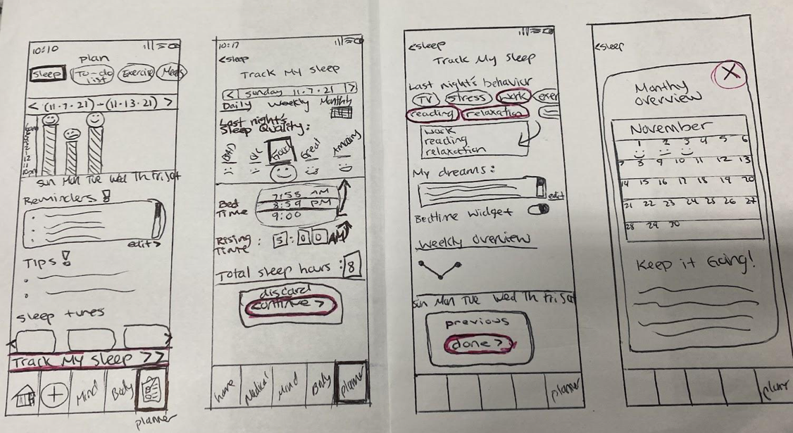
Mid-Fidelity Prototyping
Using Figma to create my mid-fidelity prototype, I added more details to better communicate specific interactions. I focused on establishing a better sense of what would happen next when items were clicked on. I used grayscale to focus on the interactions before spending too much time on visuals.
Finding a Workout
This flow shows how users would be able to quickly search for workouts as well as where they would find their favorites. The green dots represent where users would click.
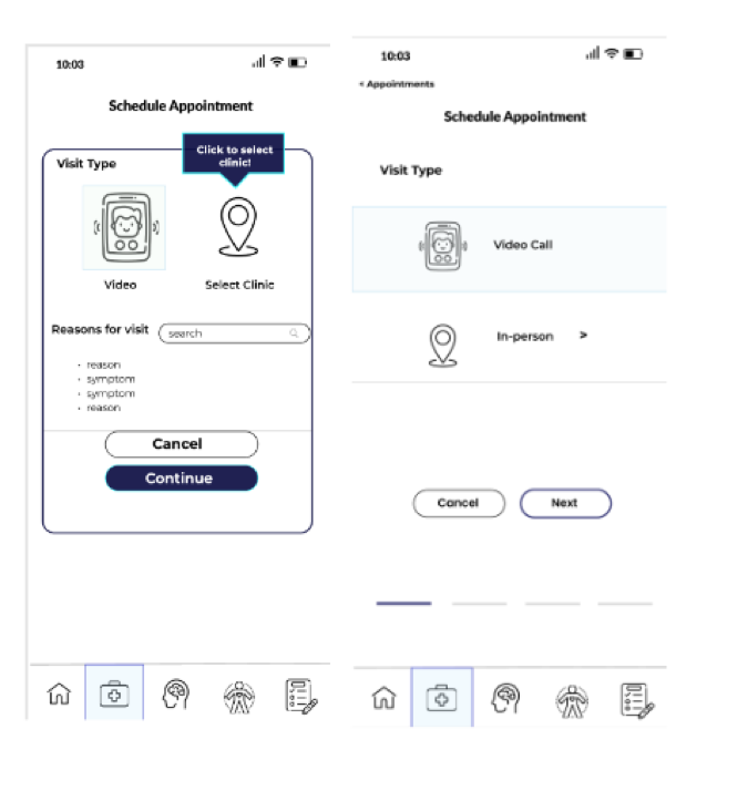
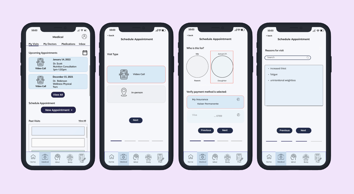
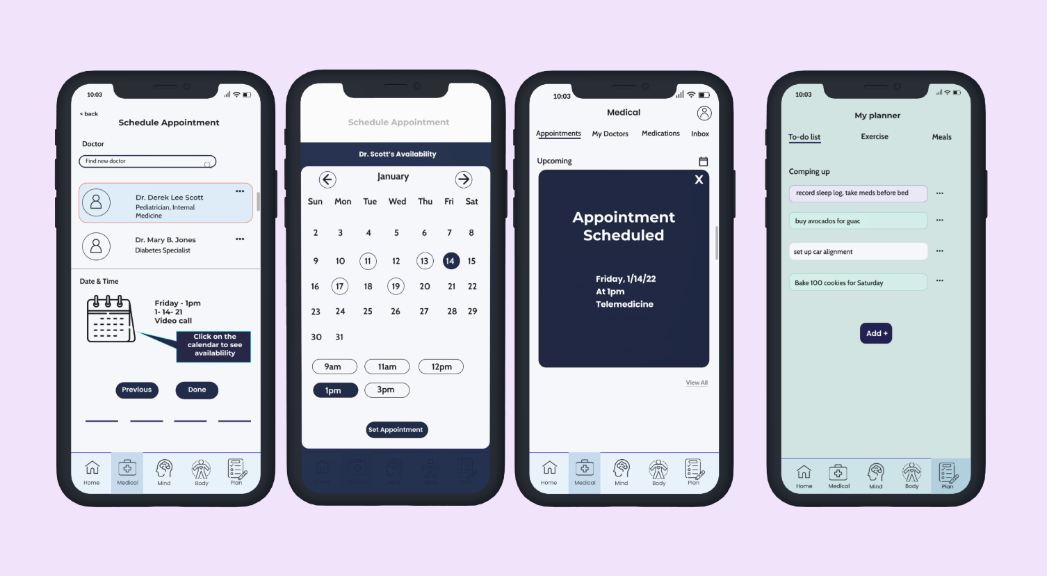
Booking a Doctor Appointment
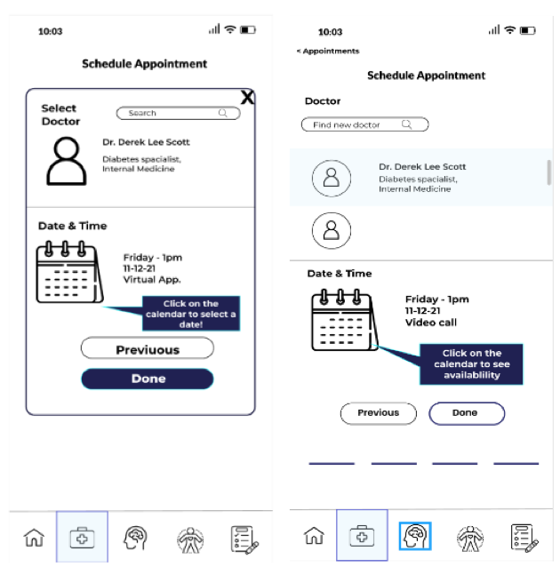
This flow shows how users will be able to book a doctor appointment
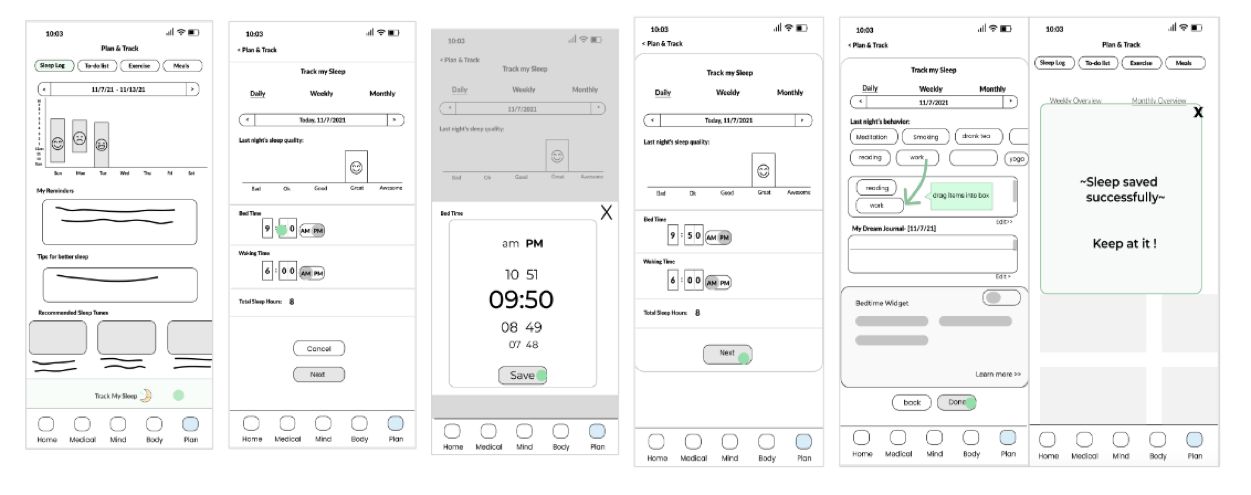
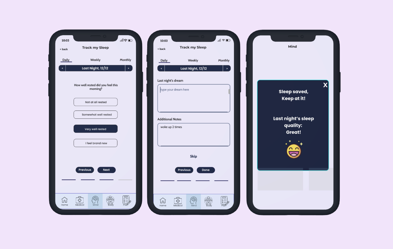
Tracking Sleep
This flow shows basic functionality of tracking one’s sleep, including usability pointers.
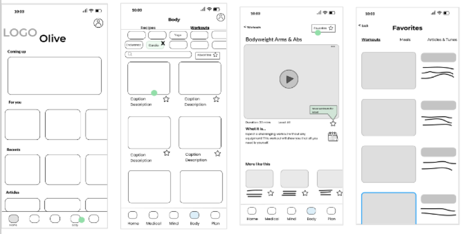
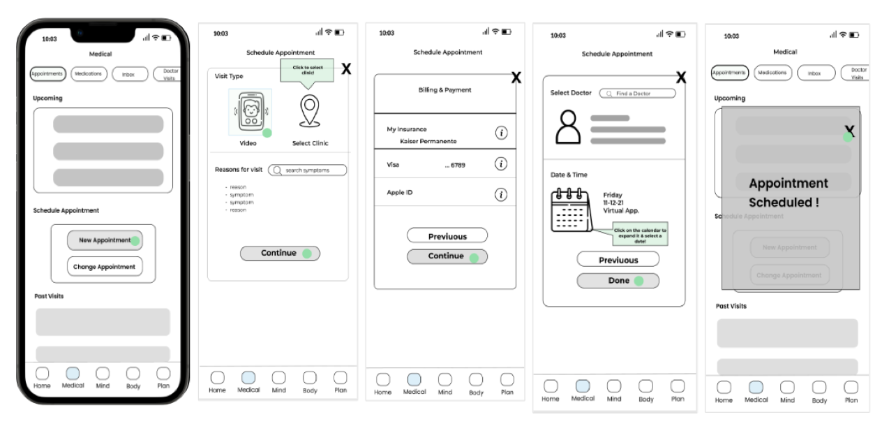
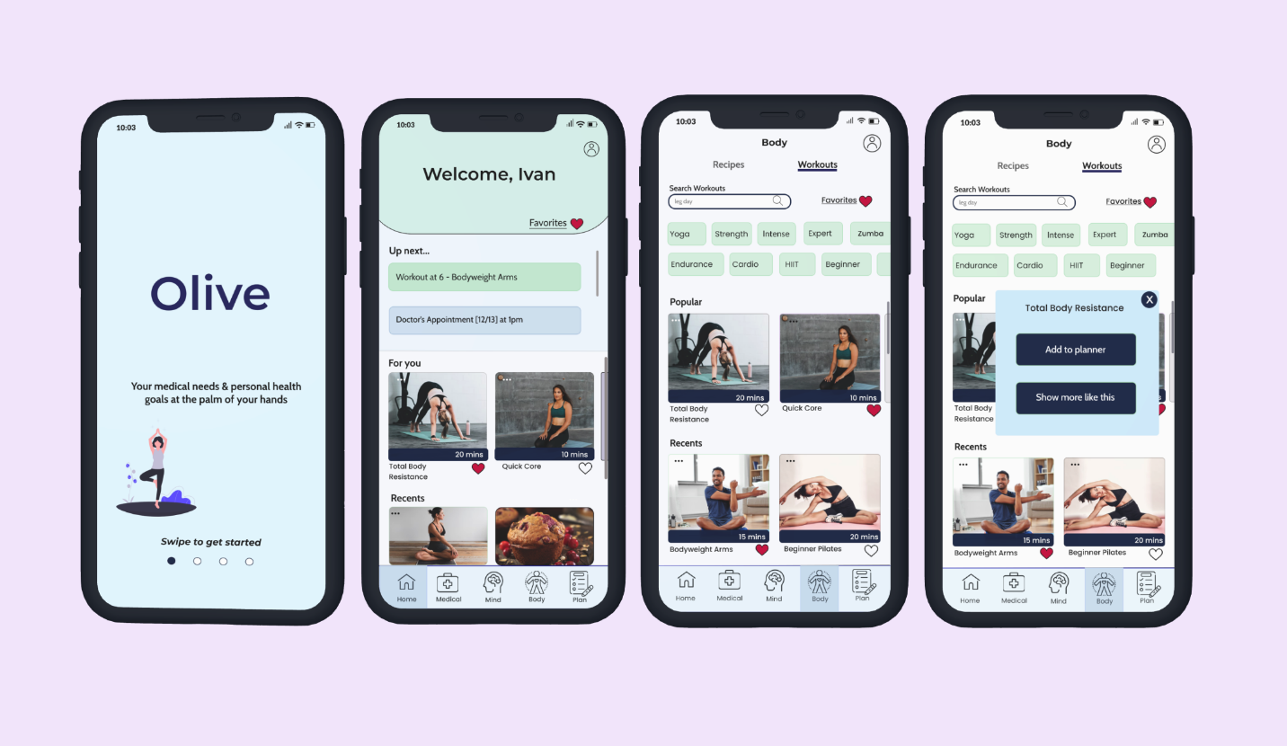
High - Fidelity Prototype
For my high-fidelity prototype I focused more on the placement, fonts, and button sizes. I wanted to generate the look and feel of the app, adding minimal color & omitting specifics.
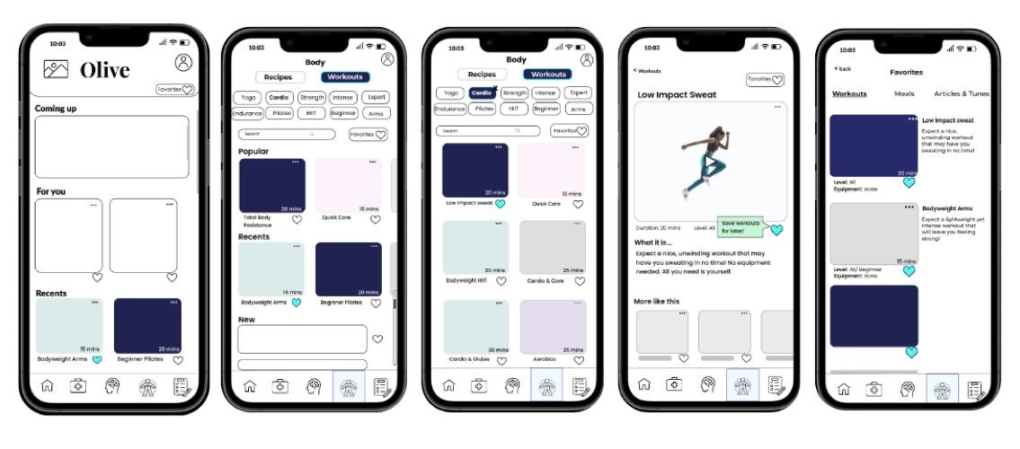
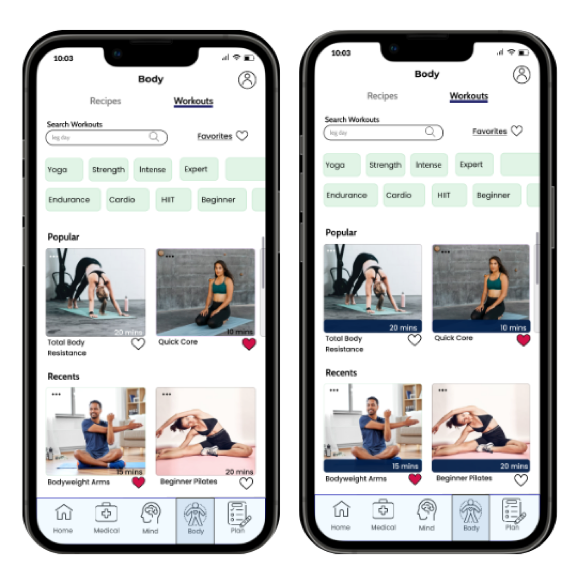
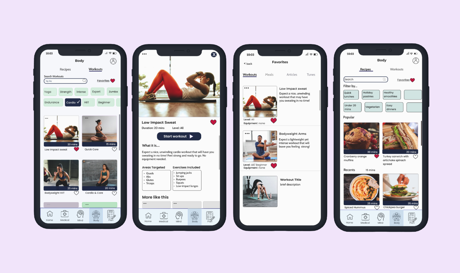
Finding a Workout
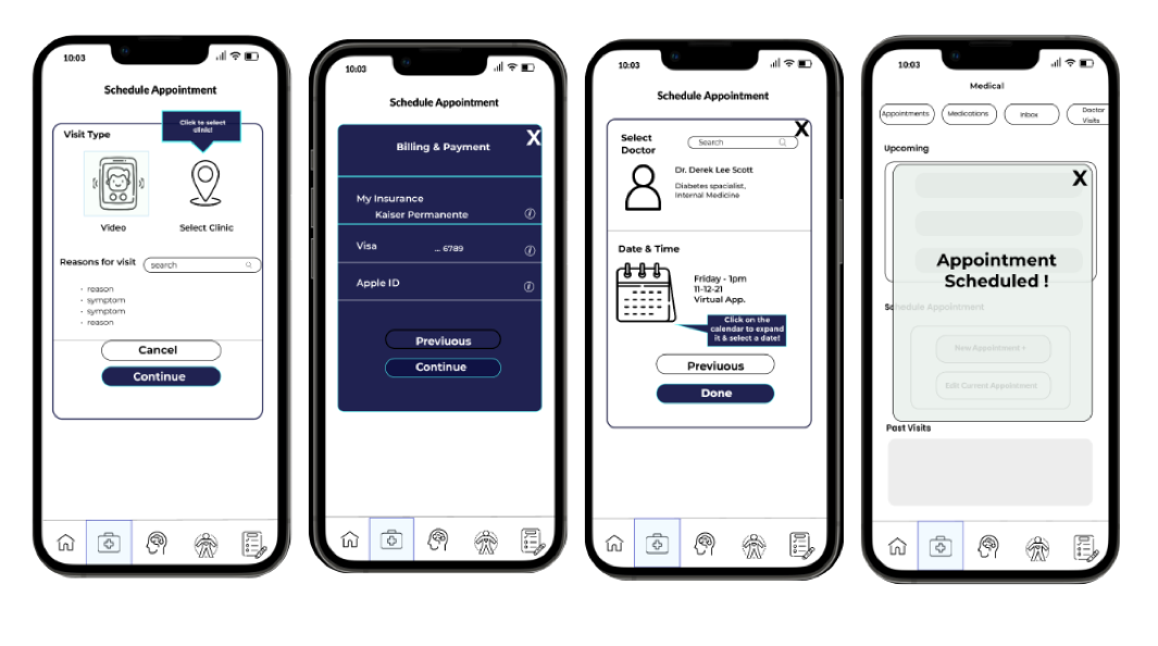
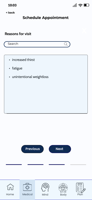
Booking a Doctor's Appointment
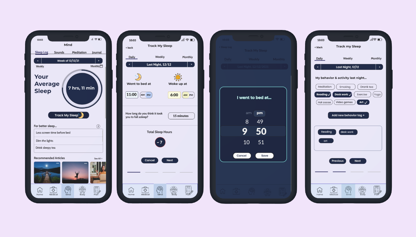
Tracking Sleep
6) Test
Usability Test
After conducting a series of moderated and unmoderated usability tests with 6 participants, I sorted out the data into an affinity map and used a rainbow spreadsheet to showcase which data point– or error found– belonged to its corresponding participant. Then, I created the following affinity map to identify insights.
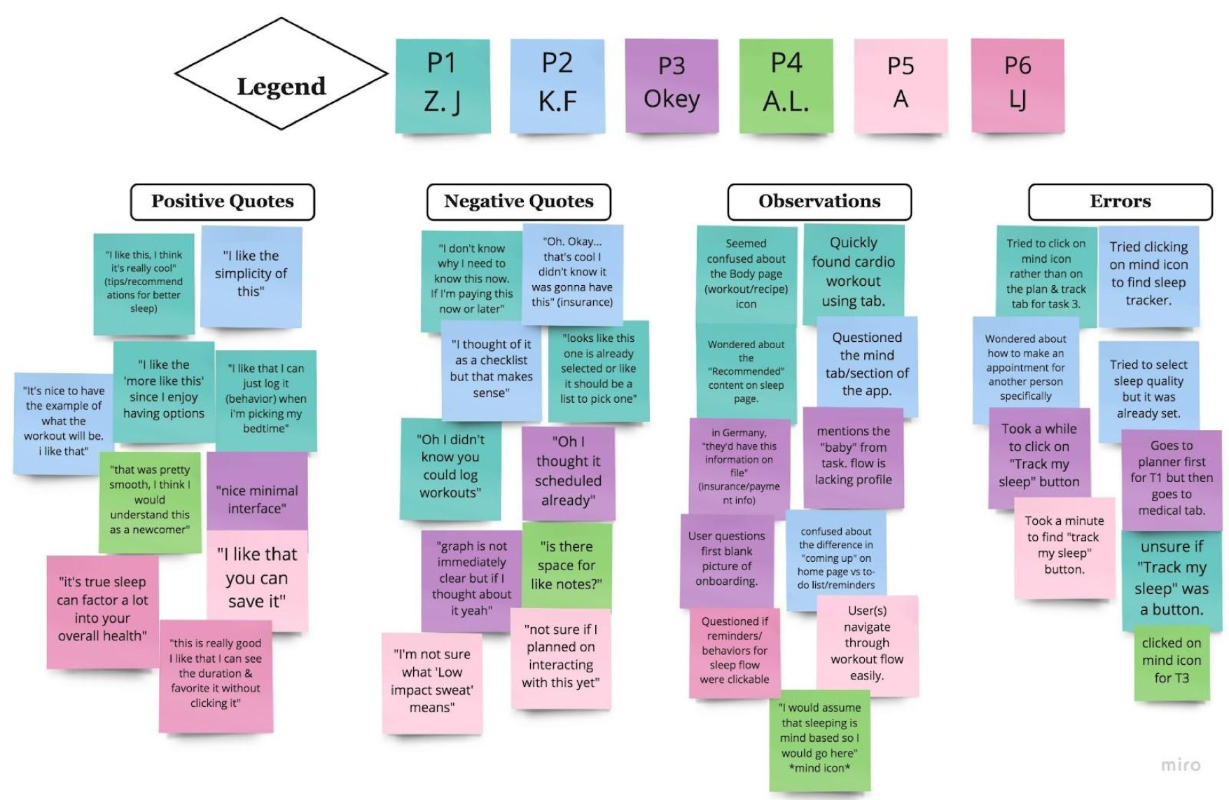
Affinity Map
The map helped me further understand user attitudes, needs, and expectations. The rainbow spreadsheet also helped me rate the errors based on frequency and usability issue. After this, I proceeded to make fixes based off my prioritized errors.
- It’s important to make the users feel at ease and make sure that tasks are easily understandable.
- My “Sleep Tracker” feature could be placed under the “mind” or mindfulness page since five of six users navigated to that page when listening to the task.
- The flow for booking a doctor’s appointment could use clarification.
- Sometimes it is necessary to improvise when asking users to navigate through your prototypes so as to dig deeper and gain a better understanding of their feelings and perceptions.
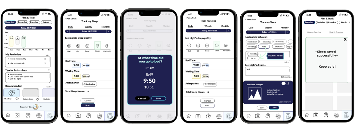
Updates based on testing
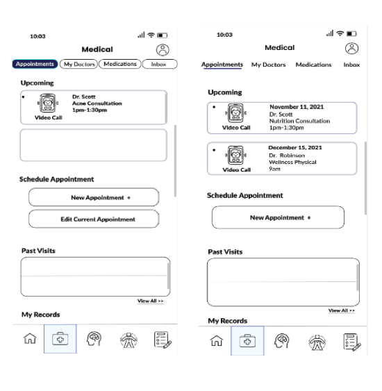
Users should be able to click on an appointment in order to edit it. The edit current appointment button was deemed unnecessary, and I agreed.
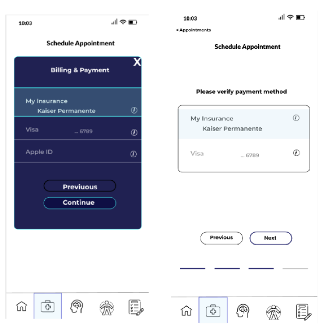
This change made the items look more clickable, but most importantly it clarified that this step was simply a verification step (all insurance or payment info has been logged)
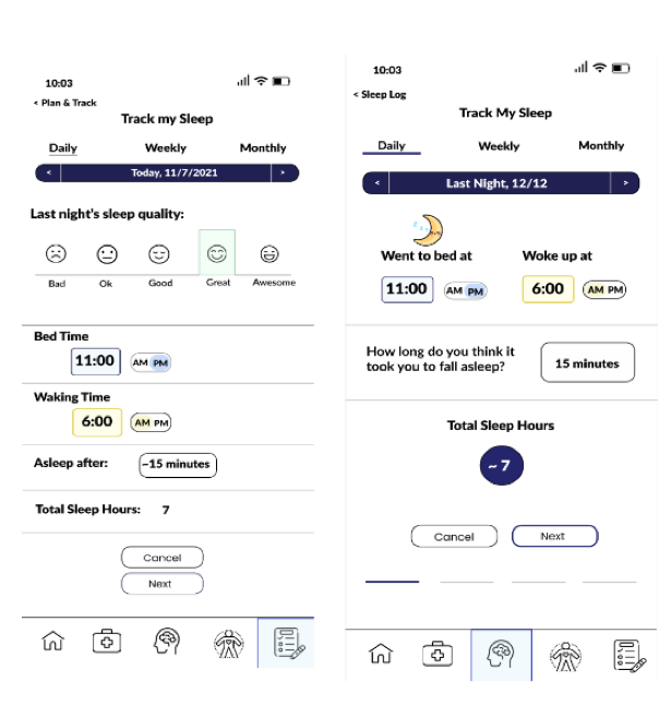
Rather than having the user guess their sleep quality, the app would eventually let them know based off of their input.
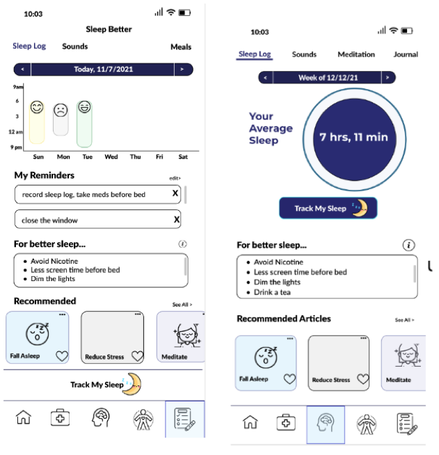
Users preferred to see their average sleep first over their weekly progress. This was also verified with a preference test.
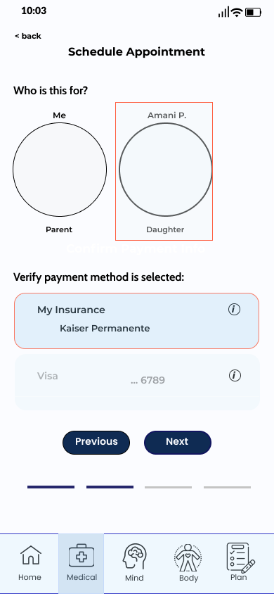
This page was added to the flow so that users can have the option of booking an appointment for their family.
This page was added so that the app had a better way of calculating the user's sleep quality. The bedtime widget was also not needed during the sleep tracking flow. It could be found within he sleep log page or under settings.
Design Language
After implementing visual design principles and incorporating grid fundamentals, I finalized the design language so as to refine the user interface of the app and establish a better consistency, including button styles and icons. Below is my color palette:
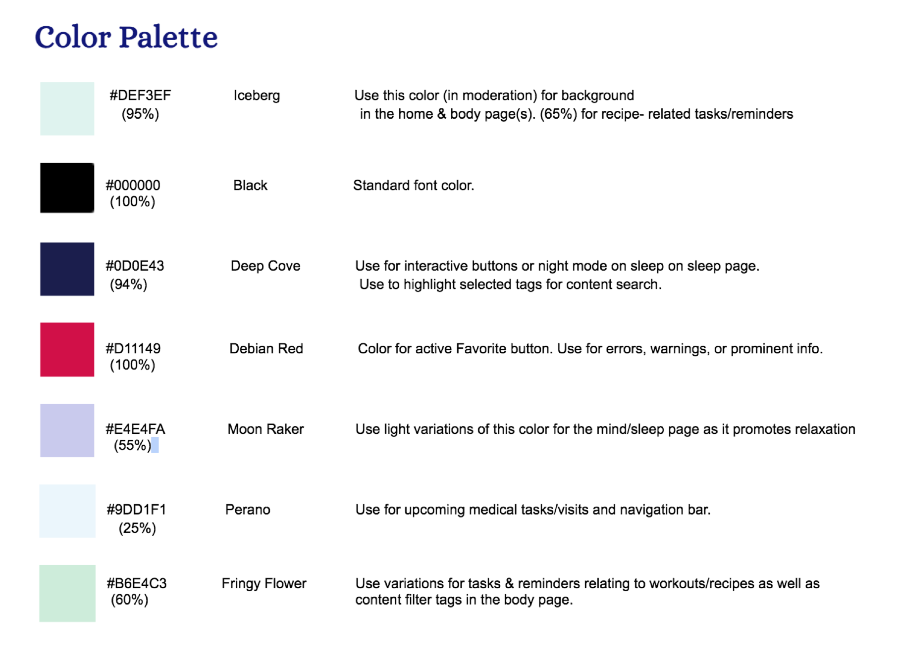
I based my colors off what I wanted to invoke within our users. I wanted to promote an enthusiastic, light-hearted, and productive way of handling health-related tasks. For instance, since blue increases productivity and is related to the medical field, I used a light-hearted blue to highlight these tasks. And since lavender promotes relaxation, I decided to use it for the mindfulness/sleep page.
Tell Story
Designing for Accessibility
After applying my style guide along with a few pointers from a few designers, I also made sure my design was more accessible.
Here, I made sure the input fields had a greater contrast with the background color to improve visibility. I also added placeholders to clarify what type of information is being filled.
The visibility of the estimated time to complete a workout or recipe was too dependent on its contrast against the images. For consistency and greater visibility, I decided to add a dark blue bar with white text on each content card. This way, users can easily spot the approximate time an activity will take.
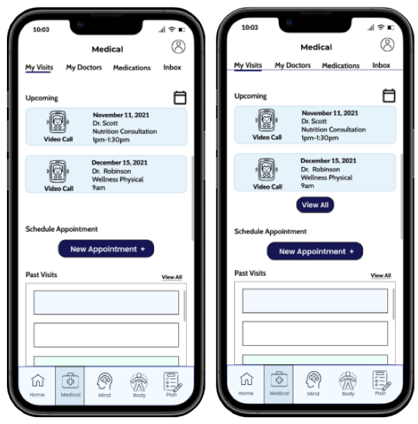
Initially, users would be able to view all their upcoming appointments once they began to scroll. However, this left doubt as to whether or not the functionality existed. For clarity, I decided to add a ‘view all’ button underneath. Additionally, I accentuated the top bar navigation by adding a line across the labels so that they are easily grouped and spotted by users.
Updated high-Fidelity Prototype
After an iterative process, I went through a lot of changes and discoveries that helped me create a well-suited platform. I focused on maintaining a user-centered approach by iterating to their needs and making sure the app was intuitive and accessible. I applied design thinking, which is definitely an iterative process, and even used agile methodologies to generate more ideas that contribute to a great user experience.
Although I faced some challenges along the road– such as iterating on the IA, receiving conflicting feedback, and realizing I had made design mistakes– I learned a lot by applying what I learned from interviews and critiques. Below is the updated prototype. I’ll leave the Figma link here!
Conclusions
Going through this process really shed a light on maintaining a user-centered approach when designing usable, intuitive platforms. Using the design thinking process, I was able to continuously grow and iterate as a designer. This helped me catch discrepancies in my designs and allowed me to use raw user data to create a product that would better benefit the intended users. I plan on iterating on my designs to refine accessibility and hope to conduct more user testing to better accommodate their needs.